Taylor Swift
November 29, 2014
 I’m not going to lie, I used to hate Taylor Swift (sorry Taylor). Her first few songs while catchy seemed out of tune to me and I thought she was all flash and no talent. I was wrong. She has proven herself to be first and foremost, a good singer as well as a good song writer and the package is tasteful, pretty and she someone I wouldn’t mind my daughter (if I had one) looking up to. She’s the real deal.


I know 48 year old men (yes, I’m 48… get over it I have) like myself are not the target audience for Taylor, but thats the genius of Taylor Swift. Her tunes are so catchy and good we ALL like them, even those who still resist, find them selves humming one of here tunes after hearing it in the grocery store, the elevator or the DMV. I’m not asking you to love her if it’s just not your cup of tea but do me a small favor and read the bio below, and then tell me she isn’t pretty amazing.


24 year-old Taylor Swift is a seven-time GRAMMY winner, and is the youngest winner in history of the music industry’s highest honor, the Grammy Award for Album of the Year. She is the only female artist in music history (and just the fourth artist ever) to twice have an album (2012’s RED and 2010’s Speak Now) hit the 1 million first-week sales figure.
With RED, Taylor became the first artist since the Beatles (and the only female artist in history) to log six or more weeks at #1 with three consecutive studio albums. RED has topped the Billboard 200 Albums Chart for seven weeks, following Fearless (11 weeks), and Speak Now (six weeks).
With more than 1.2 million copies sold in the U.S. in its first week, RED scored the highest first-week sales debut of any album in over a decade, had the 8th largest first-week debut in chart history, and marked the 2nd biggest week ever for a female artist. Taylor’s lead single from RED, “We Are Never Ever Getting Back Together” set a new record for the biggest digital sales week ever for a song by a woman, and for the second-largest sales week overall.
With RED, Taylor also set a new worldwide iTunes record for highest ever first-week album sales, and RED reached #1 on iTunes and national sales charts in 50 countries, including the UK, Canada, Brazil, Japan, Mexico, Malaysia, Ireland, Argentina, New Zealand, Ireland, and Australia. The RED Tour heads to Europe in 2014.
In early 2012, Taylor’s Speak Now album was lauded on Rolling Stone’s prestigious The 50 Greatest Albums of All Time (by women) list, and Time magazine has named Taylor one of the 100 most influential people in the world. She is Billboard’s youngest-ever Woman of the Year, and her more than 100 industry award wins have included the American Music Awards’ Artist of the Year (twice), the Country Music Association and the Academy of Country Music’s Entertainer of the Year (both also twice), and three European Music Awards. Taylor is also the most awarded star in the history of the Teen Choice Awards, taking home honors for both music and movies.
Taylor, who writes all of her own songs, has career record sales in excess of 26 million albums and 75 million song downloads worldwide, and her two most recent albums are two of only 18 albums in the entire history of music to sell more than 1 million copies in a single week. She has had singles top both the country and pop radio charts around the globe, and has thus far scored 13 #1 singles across multiple radio formats. She is one of the top 5-selling digital music artists worldwide, and is the top-selling digital artist in country music history.
Taylor is Billboard’s reigning Artist of the Year and holds the Billboard records for the Most Top 10 Debuts in the History of the Hot 100 Chart, the Most Charting Songs from One Album in a Single Week, and the Longest Charting Album on the Top 200 Chart.
This year, the North American portion of Taylor’s RED Tour played to more than 1.36 million fans over 66 shows (including 13 stadium stops) in 47 cities in 29 states and 3 provinces spanning 6 months. And, starting in late November, Taylor will take her RED Tour, which Rolling Stone dubbed “a massively excellent show,” Down Under, performing stadium shows in Sydney, Melbourne, Brisbane and Perth, as well as arena dates in Auckland. Swift will be the first solo female artist in twenty years to undertake a national stadium concert tour of Australia.
Her SPEAK NOW World Tour played 111 shows to more than 1.5 million fans in sold-out stadiums and arenas in 19 countries spanning four continents in 2011 and 2012. Her 107-date FEARLESS 2009/2010 Tour sold out arenas and stadiums in 88 cities in five countries.
Taylor voiced the character of Audrey in the 2012 hit movie “Dr. Seuss’s The LORAX,” and has written the end credit song “Sweeter Than Fiction” for the movie “One Chance,” a bio pic of Britain’s Got Talent winner Paul Potts. She also contributed two songs to the soundtrack of the movie “The Hunger Games,” winning a Grammy Award for Best Song Written for Visual Media, and earning a Golden Globe nomination for Best Original Song. She has hosted Saturday Night Live, appeared in the Garry Marshall film “Valentine’s Day,” and guest-starred on the Emmy-winning TV drama CSI.
*This biography taken from MTV.com

the very talented JESSICA HELGERSON
November 22, 2014
So, a friend and fellow designer John De Bastiani posted an image of this sweet little house on his Facebook page the other day and I immediately recognized the bunkroom picture from a shelter magazine… I have loved and coveted this room for a long time. And now, I glad to know who created this beautiful and respectful tiny house, Jessica Helgerson. 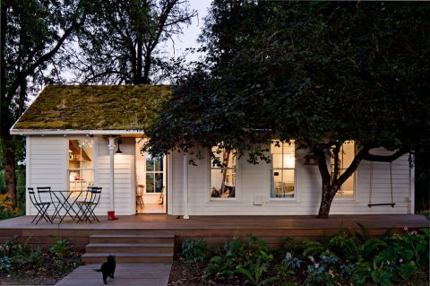
With more than 15 years of experience designing residential and commercial interiors Jessica creates interiors that are typically clean and uncluttered. Adept at many styles, she is happy to be guided by her clients’ individual needs and tastes as any good decorator is. Jessica likes to start by considering what the best design for the client might be while considering the best design for the building or space. Her goal is to ensure that the fundamental design and the materials are classic, long lasting, and appropriate to the building and its period. She likes to layer on fresh, contemporary elements—such as lighting, furniture, and art—that feel just right for the clients and for the moment. I’m a fan, and if I wasn’t a control freak.. I’d hire her to do my next house. Just look at this tiny house she designed!
 This little house is where Jessica and her family have been living for the last several years. It sits on a five-acre property on Sauvie Island, an agricultural island on the Columbia River 15 minutes north of Portland.
The house is an interesting experiment in reduction and reuse not only because it is only 540 square feet or because it was remodeled using nearly exclusively reclaimed materials, but because the building itself is now being recycled for the fourth time. It was first built in the early 1940s as part of Vanport Village; a quickly erected development built to house shipyard workers. When Vanport Village flooded in 1948 this particular little house was floated down the river to Sauvie Island, where it became the goose-check station. Years later it was remodeled to become a rental house.
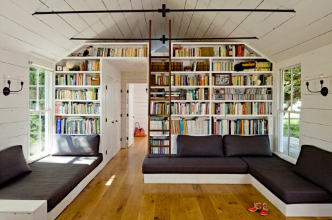
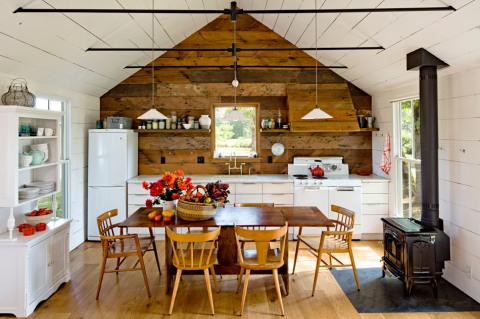
When Jessica and Yianni bought the property in late 2008, they decided to remodel it without adding to the existing footprint. Their first step was to redesign the interior for maximum space efficiency. A ‘great room’ houses the kitchen, dining room and living room with large, comfortable, built in sofas that double as twin beds for guests. Drawers under the sofas hold children’s toys and a wall of shelves houses books and more. The ceiling was opened up in the main space, but the bathroom and bedroom have lower ceilings to accommodate the parent’s sleeping loft above, accessible by a walnut ladder. The children’s room has two bunk beds as well as a full bed for guests. A pull-out closet makes maximum use of the narrow space near the bunk beds.
New high-efficiency windows come right down to the sofas and offer a fun way for kids and cats to enter and exit the house. The walls were insulated, then faced in reclaimed wood siding, most of which was found on site in one of the barns. The
new floors are local Oregon white oak, and the dining table was made from locally salvaged walnut. The range is a vintage Craigslist find, and the tub was a salvaged from a friend’s demolition site. A wood-burning stove easily and efficiently heats the small house.

As part of the remodel, the worn out roof was replaced with a green roof, planted with moss and ferns gathered along the Columbia River Gorge. The green roof offers insulation as well as a playful visual counterpoint to the traditional white cottage.
Despite its size, the house is welcoming and comfortable and nearly every weekend it is full of family and friends coming from Portland to enjoy a day in the countryside. In addition to living in a small footprint, Yianni and Jessica have been working towards food self-sufficiency. Their first year on the property they built a 1200-square-foot green house, planted vegetable gardens, rows of berries, and fruit trees. They are also raising chickens for meat and eggs, keeping bees, and making cheese from the milk of a neighbor’s goats and cows.

http://www.jhinteriordesign.com
*Much of this text was taken directly from Jessica’s website, with the intention of “getting it right” and sending the intended “message” out of respect for Jessica, her brand and her work.
I’m all about paying respect, honoring craft and celebrating others in my field. Please click on the web address above to see Jessica’s full website.
MARY O’MALLEY – Bottom Feeders
January 25, 2013
And now for something completely different. I shop everywhere, the gift show in NYC, local antique stores, the showroom I work for as well as Ebay, 1st Dibs and ETSY. Well I was scanning ESTY for cool things the other day and came across the amazing work of Mary Malley. um, Hello! I am crazy for these beautiful pieces. Mary is a ceramic artist creating out of a barn on the south shore of Long Island. Her ESTY store is a dedicated to the ceramic functional wares she loves to make! Please click over and see more of her work www.etsy.com and for additional information you can visit her website at www.maryomalleyceramics.com. Mary makes custom cremation urns, I might have to get one for myself… Not that I’ll need it anytime soon! For more information please visit http://www.youveurnedit.com If you have any questions or are looking for something in particular feel free to contact her at: mary@maryomalleyceramics.com

Here is her artists statement: After receiving my BFA from The University of the Arts and living In Philadelphia I recently returned to my home near the ocean on Long Island, NY. Using my skills as a potter trained in traditional English and Japanese techniques I began to create a series of formal functional pieces to which I applied small sea creatures. The images are inspired by memories from my childhood and new familiar surroundings. Covering formal ware in crustaceans – which in real life have an unforgiving ferocity – has interested me because it is a reminder that no matter how much we try to control the creation of what we think is beautiful, uncontrollable forces like nature usually end up taking over. What truly excites me (and keeps me needing to make more) is marrying my love of functional porcelain pottery and a whimsical (or ferocious?) underwater world that mars the formality of each piece. The journey I take in deciding how to incorporate and compose these underwater elements with the service ware it is enveloping is what makes each piece completely unique. In the end one type of beauty is made more beautiful by co-existing with its foil, resulting in two completely different aesthetics existing harmoniously as one piece.


Neal Beckstedt – Interior Designer
January 8, 2013

Not just a pretty face… Neal Beckstedts interiors are as easy on the eyes as he is. He describes his style as “modest luxury”. The Manhattanite creates spaces that are modern yet warm, layered but clean and has worked with high profile clients like fashion star Derek Lam. A self-described “farm boy from Ohio,” Beckstedt says that his home state has had a major impact on his mind-set. Neal worked with S. Russell Groves for almost a decade before opening his own studio in 2010. Authority, functionality, and a Scandinavian-style appreciation of how natural light enriches such honest, straightforward materials as nubby wool, polished wood, stainless steel, and velvety plaster are hallmarks of his work. No matter the location Beckstedt’s style always lends itself to interiors for living rather than for simply admiring. Get to know more of Neal on his website: nbeckstedtstudio.com


Melissa Baum – Monochromatic Love
January 5, 2013
This year is all about celebrating the people behind the great design we see in clothing, marketing, building, architecture, jewelry, furniture, fine art, cars and yes… Interiors. Monochromatic Love is a blog post from the Wedding Blog by Melissa Baum. This woman knows chic and should be consulted for any and all things wedding. I instantly fell in love with her images, attention to detail and creative ideas, so I’m sharing it with you… pay it forward. If you have a wedding coming up or a loved one does… please consult her blog for more good ideas than you have the time or money for, seriously… but you will get some great ideas and confirm others, I promise! Her Words:
To tell you all the truth, ombre highlights is what really inspired this post! Why not bring the ever popular hair do to the wedding scene?! Known as monochromatic in wedding world – it means using only one color. Now one color does not mean one shade. That is really the beauty of this! You choose one color and go nuts within your palette. Taking tips from my favorite bride Trista from the Bachelorette, who went monochromatic in pink with chairs and flowers ranging from light to dark shades. (Picture from her wedding shown below) This colour shade trend is anything but shady!
(the ombre text was my idea, that was me… I did that) lol.
The Pinks.

The Blues.

The Yellows.

The Greens.

The Purples.

Bill Ingram – Architect
January 3, 2013

Facebook is a crazy and great place. It’s where friends are made, kept, re-made, and where family, friends stay in touch and sometimes friends of friends of friends turn into friends. Bill Ingram is someone I have never met, but I’m friends with a member of his staff and now we are acquainted via Facebook. His work is some of the best I’ve seen in a very long time. Bill’s work can have a whimsy, but it’s not silly, It says quality and luxe without being unnecessarily extravagant, it’s updated and fresh but it has the look that it might have been there forever. Frankly his work is so top-notch, I’m fearful that I won’t do it justice. Enjoy these images and click over to his website to see more of his beautiful work.


 Enjoy more of Bill’s work here: http://billingramarchitect.com

Black & White
January 1, 2013
The white painted brick, white beams, black floor… yes please. The painted ceiling and brick, although painted white offer great texture and depth. Most people think of black and white interiors as pretty last-luster but this pallet is the perfect back drop for and lets art and furnishings stand out.


ALL WORK BY: http://www.davidhowell.net
 Um, YES PLEASE! do you love this sconce as much as I do?
William Haines designed the original “Ice Crystals” Sconces for the May house in 1953, using faceted pieces of acrylic material. This limited edition is offered as an exact opposing pair. Reflecting the sparkling glamour of Hollywood , the sconces are a brilliant accessory to traditional or contemporary interiors. As modern as they were in the 50’s these would look amazing in a urban loft, organic beach house or a traditional home. That speaks to the quality of design and the timelessness of these beautiful lights.
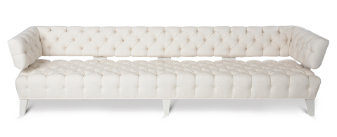
Designed for the Haines studio in 1951, the Bel-Air sofa exemplifies the essence of the Haines look – restrained modernism and glamorous scale. The back supports and legs are wrapped in leather and frame the deeply tufted upholstery. Originally made ten feet wide, the sofa is available in custom sizes. I love that the sofa has both the glam of hollywood in its heyday and the quintessential details of a mid-century piece.
William Haines Designs, located in Los Angeles, California is carrying on the Haines legacy by faithfully reproducing the original Haines furniture designs with great accuracy and penchant for this style known as Hollywood Glamour. Peter Schifando and J. Jonathan Joseph are extending the Haines aesthetic with painstaking accuracy and fulfilling the current demand for Hollywood Regency design. With an A-List clientele, which includes Nancy Reagan and Betsy Bloomingdale, it is only befitting that these iconic, classic designs from William Haines grace their homes.
The Elbow Chair, the Brentwood Chair, Conference Chair and Pull Up Chair are among the glamorous classics that comprise the William Haines Collection. These are authentically produced by the same California manufacturer for the last fifty years. The current Haines furniture collection are re-issued Haines Originals. They are available through William Haines Designs and select dealers throughout the United States.
William Haines Designs
MoPa (Modern Parent)
November 26, 2012
![]()
MoPa is an event company, and online resource for parents and soon to be parents, I’d call them curators of all things baby. What is cool, what is safe, trends in baby gear, the all of it is edited with a keen eye (for style), and wrapped up pretty on-line and in their events. The folks at MoPa blog about fashion for moms and kids, they tell it like it is on latest trends, fads and must haves AND they produce vendor events so parents and soon-to-be parents can checkout the latest and greatest in person, how smart is that? I’m lucky enough to know Denell Pepin, owner/president of MoPa and let me tell you… girls got style! This young lady and mother of two has it going on. Always “on point” her parties are perfection, every outfit effortless and chic, her events are informative AND fun and she’s a great dinner companion (smart and funny). It makes sense that a lady this smart and chic would want to share her knowledge, spread the love as it were, but I was totally flattered when she asked me to participate in her Holiday Gift Guide for MoPa. 
I know what your thinking – what the heck does this guy know about parenting beyond the four-legged type of parenting? Nothing. But I know a thing or two about giving gifts… So together we created a Gift Giving Guide. We chatted about our loves for the season long enough and with such passion and conviction that she included a brief interview about my style, entertaining, etc. Click on over to see her great work and the interview Here. There are 30 days til Christmas!

Just a little bit of COLOR – Timothy Whealon
October 25, 2012
 Timothy Whealon Inc. specializes in high-end interior design with a focus on fine and decorative arts, his beautiful work is an inspirational. Today we celebrate the talent of Timothy Whealon. The following copy was taken from his website:
Mr. Whealon’s design philosophy finds its roots in classicism; however, he approaches each project with a fresh, 21st Century eye that makes them both modern and timeless. Each interior is unique, often incorporating custom pieces specific to the client and the environment. His work is enhanced by both his extensive knowledge of the international art and antiques market and by his team of skilled artists and craftsmen who adhere to Mr. Whealon’s commitment to quality and attention to detail.
 Timothy Whealon is a graduate of Kenyon College, where he studied English Literature and Art History. He moved to New York to begin a career in banking and completed a credit training program on Wall Street before pursuing his passion for the arts and design. Mr. Whealon completed the Sotheby’s Works of Art course in London and the corporate management training program with Sotheby’s New York before opening his offices in 1994. His work has been published in ELLE DÉCOR, House Beautiful, Veranda, House and Garden, Architectural Digest, Domino Magazine, The NY Observer, The New York Times – Home Section and numerous books.
 and…
and…

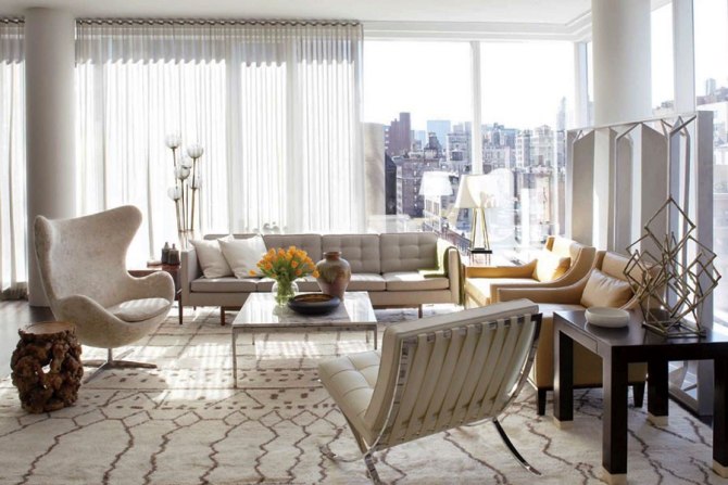
the BARCELONA CHAIR
October 15, 2012

 The Barcelona chair was exclusively designed for the German Pavilion, that country’s entry for the International Exposition of 1929, which was hosted by Barcelona, Spain by Ludwig Mies van der Rohe. A German-American architect, he is commonly referred to, and was addressed, as Mies, his surname. Along with Le Corbusier, Alvar Aalto and Frank Lloyd Wright, he is widely regarded as one of the pioneering masters of modern architecture. Pictured above in what I personally think is his masterpiece, Farnsworth House, the Barcelona Chair has become an icon of mid-century style and the Bauhaus movement.


Mies, like many of his post-World War I contemporaries, sought to establish a new architectural style that could represent modern times just as Classical and Gothic did for their own eras. He created an influential twentieth century architectural style, stated with extreme clarity and simplicity. His mature buildings made use of modern materials such as industrial steel and plate-glass to define interior spaces. He strived towards an architecture with a minimal framework of structural order balanced against the implied freedom of free-flowing open space. He called his buildings “skin and bones” architecture. He sought a rational approach that would guide the creative process of architectural design. He is often associated with the aphorisms “less is more”.

But this is about the Barcelona chair, not just its designer. The frame was initially designed to be bolted together, but was redesigned in 1950 using stainless steel, which allowed the frame to be formed by a seamless piece of metal, giving it a smoother appearance. Bovine leather replaced the ivory-colored pigskin which was used for the original pieces.
The functional design and elements of it that were patented by Mies in Germany, Spain and the United States in the 1930s have since expired. The Barcelona chair was manufactured in the US and Europe in limited production from the 1930s to the 1950s. In 1953 van der Rohe ceded his rights and his name on the design to Knoll, knowing that his design patents were expired. This collaboration then renewed popularity in the design. Since 1953 Knoll Inc has manufactured the chair. They make the frame in two different steel configurations, chrome and stainless. The chair is almost completely hand-laboured, and Ludwig Mies van der Rohe’s signature is stamped into each chair. Unauthorized reproductions proliferate worldwide and are sold under different marketing names.
 The source of the majority of this information was taken from Wikipedia
Kelly Wearstler for Lee Jofa (KRAVET)
May 11, 2012

I’ve done a blog before about Kelly and here great taste, her apartment and interior design projects are beautiful, original and fresh. Funny… so are her fabrics for Lee Jofa. There is a traditional element to most of them but they are all updated and current. Patterns of natural stone – malachite is a favorite of hers – mix with Bo-Ho chic prints and wovens that are part old school and yet very much new school. 
It’s hard to imagine a snake-skin pattern that it’s tacky but Kelly pulls it off and makes it look better than good. I love her inspired work and unique perspective. To see more click here: Kelly Wearstler

Visual Comfort – Lighting
April 23, 2012
Saw this first image on La Dolce Vita’s blog today. I’m enjoying my weekend at Ocean House and all the wonderful events scheduled into the weekend to celebrate one of my best clients birthday, but a tiny but sad I’m not at High Point in NC, getting my shop on and buying beautiful things for the store and clients. But I’m here being spoiled with the best service, in a beautiful room, partying with great friends and celebrating a good friend and client. I can’t count how many times I’ve posted about Visual Comfort, a favorite lighting manufacturer of mine. They make so many wonderful types and styles of lighting it’s really one of the only sources I need to make my clients – and myself – happy. Of course there are dozens if not 100’s of others I like including Jamie Young, The Natural Light, Vaughn, Robert Abbey, Oly, Currey & Company to name just a few… But Visual Comfort has quality, great finishes and more choices than any designer would need to complete a lighting plan from beach house to loft to city apartment to farm house, they do it all… and they do it well.
It’s my last day here at Ocean House and I am overwhelmed by the sheer number of lights the designer responsible for the furnishings has committed to. Form my bed – yes, I’m still in bad at 11:51 AM – I can count 8 lights and from memory (meaning I don’t have to turn them upside down to know that – 5 are Visual Comfort. AND, there are more down the hall… because I’m still in my Jammies, the 2 grainy shots and the end of the post – taken with the zoom on my iphone, not the best – will have to do, but just look at these handsome lights…


and from the Jammie-cam…


Geometrics On Your Floors, Walls and…
April 19, 2012
 This cool painted geometric is the backdrop in a Ralph Lauren print ad that I saw in Elle Decor recently… I’m in love with the soft hand-done look and texture it has. Raised panel-ish, it’s not really trying to be something it’s not – not a faux anything – just a beautiful texture with a three dementional quality. So of course after I saw this ad – I had been lounging poolside – I googled handpainted geometric walls and found this…
 The smarty pants – and talent – behind this writes a blog called gorgeous shiny things and her name is Danika Herrick. Needless to say I’m smitten and have a new favorite blog? Maybe. She’s crazy talented and just a wee bit crazy (who paints a fabric pattern on a sheet linoleum floor??!). Danika does, and it looks great plus she makes a mean stencil too. How awesome is the pretty little mudroom above? The pattern was borrowed from a Quadrille – China Seas pattern.
Danika also had these to offer…
You guessed it this is the linoleum floor she painted…
And these found via James Andrew ( WhatisJamesWearing.com )…

The trellis pattern below is attributed to the late great Albert Hadley… he put the old in “Old Guard” and the Glam in just about everything he touched. 
BOTTOM LINE: Everything old is new again & If it’s boring… paint it. Heck, it’s only a can of paint and a weekend, ok maybe 3 weekends, 6 bottles of wine and a divorce BUT it’ll look great. Go get a paint brush!
A Beautiful Wedding Cake – Artisan Bake Shop
April 17, 2012
 The last time I posted about a wedding cake it became one of my most viewed posts for a very, very long time. Who knew so many brides and grooms, or brides (x2), or grooms (x2) googled cakes in perpetration for their big day! I wouldn’t have guessed it, but anyway… I was invited to a pot luck dinner party the other night and I was asked to bring dessert for 15, it being a work day I knew there was really no time to create something I could be proud of in such a limited amount of time. So I called a local bakery in the hope that they may have the time to make something for me. Well let me tell you, Artisan Bake Shop in Rochester, MA not only made two beautiful deserts in less than 24 hours ( more like 7.5 hours notice ) but they knocked it out of the park with flavor and style. If you live anywhere near the South Coast of Massachusetts, Boston or even Rhode Island, do yourself a favor and find the Artisan Bake Shop! They make amazing cupcakes, cakes, pies, tarts, and yes… CAKES.

Form an amazing selection of “yes we can make it for you today” options, I picked a lemon tart and a vanilla cake layered with fresh raspberries and buttercream and let me tell you… THEY WERE BOTH AMAZING. So, I know everyone out side my local area is saying “what good does that do me” or “what do I care” but seriously, the lesson for me was that when you have a pastry artist, or butcher, or seamstress or gardener or whatever… if they are good and you can trust them do do as good a jobs as you would hope to do, let them! Take the pressure off, relax and let someone else do it for you. I had a great time at the dinner party, my foodie friends were impressed and I gave my money to a local business who I was lucky enough to have in my “backyard” (ok, it was a 25 minute drive, but well worth it!).


Guido Mocafio – Borrowed Blog
April 15, 2012
Guido Mocafico’s Magnificent Rectangular Serpents
As a person who collects art, respects the creativity of artists and a designer who appreciates beautiful works that can really make or break a home, the work of Guido Mocafico hits a home run with me. Not only would I own one of these pieces – I love the black mysterious background he has chosen, further enhancing the already sinister mood of the images – I would hope to use one or several in a space for a client. They are bold and graphic, the colors are amazing and like any good piece of art I could look at them over and over and over. Something else I like is the unexpected rectangle, these animals typically so organic and coiled shown compartmentalized and color blocked, a unique juxtaposition. 


Pinched from the pages of the Colossal Art & Design blog…
Generally when you encounter a photograph of a snake it’s coiled up in a circle, a clump, or perhaps dangling from a limb, twisted into a naturally organic shape. Y’know, it’s snakelike. Photographer Guido Mocafico has taken a decidedly different approach with his Serpens series (Part 1, Part 2), choosing instead to place the snakes into rectangular boxes, snapping each photo from above at a precisely balanced moment, turning chaotic figures into something distinctly geometric. From Mocafico’s selection of different species to their gorgeous coloration and almost zen-like positioning, I’ve never seen anything like these. For more serpentine photography don’t miss the work of Mark Laita who travels everywhere to photograph the world’s deadliest snakes. (via supersonic electronic)
Douglas Friedman – Photographer
April 4, 2012


The glam-factor of my blog went up a few notches when these got posted, ay? I have been a fan of Douglas Friedman for some time now but when I saw these images I was really enamored. His images are so rich, I love the palette on these shots. Here is a bio from his website.
| Douglas Friedman was born and raised in New York City in 1972. He studied Anthropology and Documentary Film Making at Occidental College in Los Angeles. Post graduation, Douglas worked for a few years making movies in the film industry. After working on SE7EN, The Game, and Fight Club as assistant to director David Fincher; Douglas left Hollywood with his camera, a suitcase and a one way ticket to Indonesia. The next year and a half was spent traveling the world and photographing everything he came across; from sherpas at the foot of Mt. Everest to sharks 100 feet below the Sulawesi Sea; and the architectural vernacular of each port of call along the way.
He returned to NYC in the late 90’s to begin a serious study of photographic technique and theory. His fascination with architecture and design found its way into his work and shortly thereafter, Douglas was shooting stories for Wallpaper, Domino and Elle Décor magazines. Over the next few years, Douglas began exploring his interest in fashion and portraiture and established himself shooting highly stylized environmental portraits for publications like Harper’s Bazaar, InStyle, and Vanity Fair among others. Douglas has had two exhibits of his fine art photography. The first, a collection of boldly graphic images featuring the architecture and landscapes of the rural Midwest and the urban Far East was sponsored by Missoni. The second, a colorful series of abstract portraits of burlesque dancers in New York City was underwritten by fashion design duo Ruffian. Douglas is currently working on his next show which explores portraiture that is heavily informed by the subjects’ situation. Douglas is a bold-faced name for more than just his photography. As a darling of the young international social set who gravitate towards the worlds of fashion and art, he frequently finds himself on the other side of the lens as well. His charisma and charm are as infamous as his movie-star looks and his signature 70’s moustache. He’s often written about by the same publications for which he shoots. Douglas currently divides his time between Los Angeles and New York. |
Tom Dixon
March 21, 2012
 Tom Dixon has developed a series of lights inspired by the sculptural simplicity of brass cooking pots and traditional water vessels on the subcontinent. The Beat lights are spun and hand-beaten by renowned skilled craftsmen of Moradabad in Northern India. The shapes are reminiscent of mid-century shapes but have a current sensibility and seem to look good almost anywhere. New to the collection are white versions of some of his more popular shapes. (Perfect for an all white kitchen).
Established in 2002, Tom Dixon is a British design and manufacturing company of lighting and furniture. With a commitment to innovation and a mission to revive the British furniture industry, the brand is inspired by our nation’s unique heritage. Tom Dixon launches new collections annually with products sold more than 60 countries. Follow the link above to shop all collections.

Sublime in Sebastopol
March 20, 2012
 I’m smitten with this Sebastopol residence designed by San Francisco architects, Turnbull Griffin Haesloop. Turnbull Griffin Haesloop is an award-winning architecture firm, led by principals Mary Griffin FAIA, Eric Haesloop FAIA and Stefan Hastrup AIA from our San Francisco office. They are a woman-owned business renowned for sustainable, site sensitive design of houses as well as wineries, churches, libraries and independent schools. Their work also includes campus planning, adaptive reuse and historic renovations. An integral part of the practice is interior design, headed by Margaret Turnbull Simon ASID.

Take A Little PiECE Of My Heart…
March 18, 2012
") The newLeather Bags by Jason Halsey are SO pretty! After years of honing his skills for other brands, Halsey is finally making his dream come true with an inaugural range of exquisite and successful leather bags with bold designs and colours, and outstanding finishing details. The PiECE collection for Autumn/Winter 2012 caught the attention of The Style Examiner and I had to share it with all of my readers.
The newLeather Bags by Jason Halsey are SO pretty! After years of honing his skills for other brands, Halsey is finally making his dream come true with an inaugural range of exquisite and successful leather bags with bold designs and colours, and outstanding finishing details. The PiECE collection for Autumn/Winter 2012 caught the attention of The Style Examiner and I had to share it with all of my readers.
") Halseys goal was to show the dual qualities that accessories can contribute to fashion: masculine and feminine, couture and ready to wear, craftsmanship and artistry, and even eccentricity and minimalism. The range of bags has a signature look, recurring features of ergonomic and organic lines contrasted with geometric panelling and pleating detailing. The colour palette for the collection has been inspired by the golden age of motor racing and includes colours such as British Racing Green, Racing Yellow, Pewter inspired by Aston Martin, a Red inspired by Ferrari, and dark rich Tan and Ivory White that signify the quality of fine leather car interiors. Black acts both as a statement and an accent colour throughout the collection.
Halseys goal was to show the dual qualities that accessories can contribute to fashion: masculine and feminine, couture and ready to wear, craftsmanship and artistry, and even eccentricity and minimalism. The range of bags has a signature look, recurring features of ergonomic and organic lines contrasted with geometric panelling and pleating detailing. The colour palette for the collection has been inspired by the golden age of motor racing and includes colours such as British Racing Green, Racing Yellow, Pewter inspired by Aston Martin, a Red inspired by Ferrari, and dark rich Tan and Ivory White that signify the quality of fine leather car interiors. Black acts both as a statement and an accent colour throughout the collection.
The design of the Gladstone bags, which are the collections signature pieces, has contrasting colours or leathers, highlighting the contemporary application to what is recognisably a classic shape in a playful and yet elegant manner. And this is what makes PiECE‘s designs so alluring. The pieces are all designed by Halsey but produced in Florence, Italy, by expert traditional leather makers that have been manufacturing similar accessories for top-end fashion brands such as Versace, Moschino and Zac Posen for many years. The details that Halsey has incorporated into the design of each bag make an examination of these pieces a worthwhile and enjoyable process. Pockets are lined with high-quality fabrics, and zippers and metal locks have been carefully developed.
