Blue & White
November 7, 2016
 It’s a classic that never seems to fall out of favor. Blue and White feels appropriate in any season, in any place, and in any room. The above image is a family room I designed for a summer house on the South Coast of MA. The clients were young and I wanted the room to feel sophisticated and classic but relaxed. The wide striped rug from Barrier Island Rugs sets a sporty tone and the ticking stripe on the swivel chair and the Kelly Wearstler pillow fabric all play nicely together. (Upholstery by LEE Industries)
 Stark Carpet is a leader when it comes to broadloom and rugs. They have an endless supply of patterns and styles and there is not shortage of blue and white. I’m particularly fond of the ones in my photograph that I’m using for current client. As you can see these patterns go from bedroom to living room to staircase, blue and white can be used to suit any space. (headboard by LEE Industries)

 The color story doesn’t have to stop at fabrics and rugs, Front doors, art and accessories are all fair game. Here’s a shot of my front door, a clients house and one of my most favorite pieces of art by Marine Edith Crosta. Her unique miniatures are hand painted and framed in her East London studio. The frames and glass that she uses are antiques so the sizes and characteristics can vary, which I love.

 A blue and white palette benefits from an added neutral or a pop of color like red, but that doesn’t mean you have to add another color. That said you can also play with the amount of each color you use to find the loo you want. I love a dark blue room with a crisp white chair rail, like the Private club house I designed for a local Golf Club.

 Things that go well with blue and white rooms: Tortoise Bamboo Blinds, White Shutters, Brass Accents, a Pop of Color and more Blue and White. Thanks for stopping by…

L.B.F (little black faucet)
September 11, 2016

I want to do something unusual in my bathroom remodel and I love the look that brass fixtures give a room but I worry that in my marine environment that the brass won’t stay pretty for long. I don’t need it to stay perfect forever but that’s not the only reason I’m afraid to use it on this project. You see, it might come off as a bit to glammy for the house. In fact I’m pretty sure I’ll have to save that look for a different project. I need something a bit more subdued, rustic but modern. The obvious choice is black.


To me black fixtures in a bathroom give a Scandinavian vibe. It’s european for sure but there is a modernity that says Danish modern and mid-century to me. I also like the 20’s 30’s aesthetic black and white give, again it’s modern… but modern with a twist. I’ve never in my 25 plus year career spec’d black fixtures for a bathroom, if you can believe that. So, I have no idea how it will hold up. or if it will look bad in a year. or if upkeep is hard… but i think I’m ready to experiment with my own bathroom, before I tell a client they ought to go for it.
 I’m going to go with Dorn Bracht for my faucet and shower sets. There are many brands that offer black as a finish, but I love the X handles of the Tara series and the clean smile neck of the faucet. Pop back in a few days… I’ll share some inspiration images with you so you can see the look I’m going for.
Happy Easter!
March 27, 2016
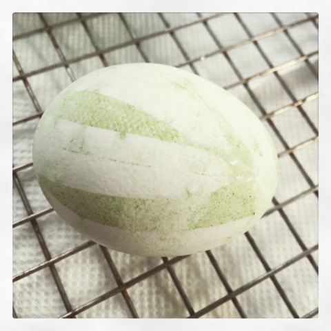
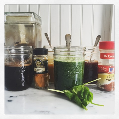 Easter for me is a time for Bunnies, Chicks, Eggs, Easter Baskets and of course Egg Decorating… However you choose to spend the day, I hope you and your loved ones are together, sharing food, prayer, or your Easter Baskets. I chose to spend the morning peeping some eggs and this year I thought why not try the natural approach to coloring. I decided to try coffee, turmeric, chili powder, and spinach (because I really wanted green).


The colors are subtle, some more successful than others, and some didn’t really work at all. The big surprise is that I like the coffee the best! Turmeric worked well too, but chili powder and spinach were a bust… so I broke out the food coloring. I was carful to not over dye the eggs, because I wanted a soft natural palette this year. I’m not sure where this technique of wrapping the egg with mesh or a piece of nylon stocking came from (or I’d give credit) but I think it’s a great way to add visual interest, while keeping it natural. 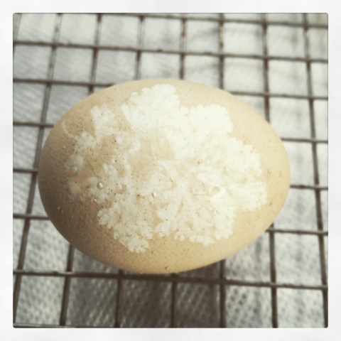
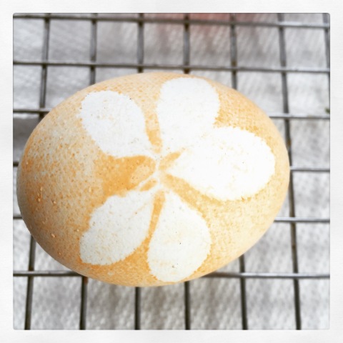
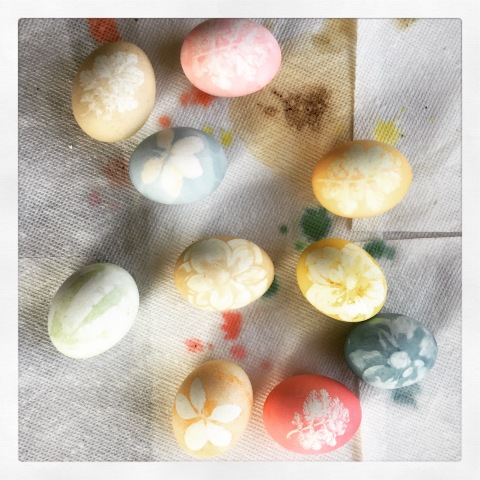 Here are the results. I’m pleased with how they turned out, there were one or two I’m not showing you but for the most part the method is easy, and produces good results. I love the flower , I used hellebore because it’s really the only thing blooming in my yard right now. I foraged some bamboo leaves, some evergreens and a small fernlike plant that I’m pretty sure is a weed… but a pretty leaved weed. Hey, on March 26th in the garden you can afford to be too picky. Note: choose soft non-woody plant materials and avoid thin spindly plants, they don’t work well. I added vinegar to both the traditional dyes and my “spice dyes” , i have to be honest I don’t really know what is does, but we did it when I was a kid, and you add it to PAAS so I added it. Good luck if you’re dying eggs today.
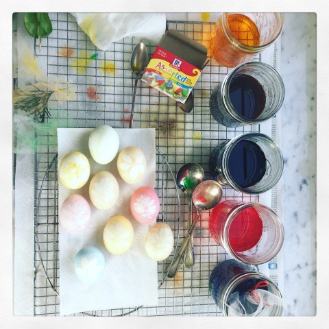
the DUNMORE
January 11, 2016


So, this is what heaven looks like I’m sure. No… Really, H.E.A.V.E.N. At least I hope so. Just look at the beauty called the Dunmore Hotel & Resort. I think their design team nailed the look! The entire resort has a sophisticated yet relaxed look to it, one that allows you to exhale but reminds you that you’re somewhere special. Just look at the dining room shot below, I love the collected treasures and old photographs… they add warmth and patina to an otherwise crisp and bleached out space. And, who doesn’t love a stripe? They are clearly cuckoo for stripes judging from these pictures (pictures that were in fact found on Instagram, I give credit at the bottom for each individual who posted them).


In their own words…
Welcome to The Dunmore, a Harbour Island resort where the exceptional is part of each day. At our Caribbean beach hotel, you’ll experience the profound warmth of our people in a timeless retreat that blends classic elegance with contemporary comforts.
Our resort in the Bahamas overlooks the sea’s spectrum of blues and the celebrated pink sands that are uniquely Harbour Island. Join us at The Dunmore for your Bahamian holiday, and discover why we have been inspiring memories since 1963.
A little bit about the island…
Harbour Island, in the Bahamas, is one of the most celebrated destinations in the Caribbean. On the Atlantic side of the island are the famous pink sand beaches. A three-mile stretch of indescribable beauty, the sand here is truly pink. Sifted and smoothed by generations of waves, the sands are coloured by finely crushed coral. A light rose blush by day, they become a vibrant pink at sunset. With its gentle sands and the ribbons of blue in the sea, it is often called the world’s most beautiful beach.
Beyond the beauty of the beaches is the charm of the island itself. This precious place is a historic destination, dating to 1791 when Lord Dunmore, who had a summer residence here, planned the streets of the town. Today, well-preserved cottages are nestled along the streets where golf carts are now the transportation of choice.


I wanted you to see the folks who captured these great images… follow them on Instagram!
Blackberry Farm
January 7, 2016

I’ve never been to Blackberry Farm but these images (all from Instagram) made the decision for me to add it to my “must visit” list. I had never even heard of this beautiful place until today, but just look at it. I’m sure my southern friends will say “hello, where have you been…” I’m just happy to have discovered Blackberry Farm. The decor and care and attention to detail is clearly something they pride themselves on. To see many more beautiful images and to learn more about Blackberry farm visit their website here. Here’s more in their words (taken for their website)…


In 1939, Mrs. Florida Lasier of Chicago snagged her silk stockings on a wild blackberry bramble while exploring the idyllic Smoky Mountain foothills, and the name Blackberry Farm was born. Thirty-nine years later, the Beall family invested their hearts and souls in the same romantic site that has become their family home and lifelong passion. Today, one of America’s most celebrated intimate luxury hotels beckons discerning guests who aspire to escape modern-day frenzy and slip into a Blackberry state of mind. Situated on a pastoral 9,200-acre estate in the Great Smoky Mountains, Blackberry will show you the many reasons why it is one of the top rated properties in the world.

Whether you select the intimate charm of an Estate Room, the legendary elegance of a spacious Singing Brook, Farmstead Cottage, Holly Glade Suite or luxurious comforts of a Hill Cottage, Blackberry Farm’s accommodations offer a haven of carefree comfort. From heavenly feather beds adorned with sumptuous linens to plush robes and luxurious amenities, your accommodations reflect a meticulous attention to detail.

Winter Rates available January – March:
Roaring fires, frosty mornings and everything signature Blackberry Farm in between – plus our annual winter rates for rooms and activities. No matter what draws you, there are plenty of reasons to slip away to Blackberry this Winter and enjoy the stillness of the smokies during truly one of the loveliest times of the year.
(Winter rates available from January 1 – March 13, 2016)
Winter Romantic Escape: Spend more time together at Blackberry Farm in an exclusive offer for a complimentary fourth night when you book three weeknights during December-March. You will also receive a split of champagne on arrival, a seasonal welcome amenity, and a rose petal turndown one evening.
Call 800–557-8864 for information and details. *subject to availability
 No promotional enticements or fees were paid for this blog by Blackberry Farm or another person or company. This is just me, telling you what I think is chic and what deserves to be celebrated and admired.
Stairway to Heaven
January 5, 2016

An architect makes a house, a staircase makes a home… if it’s a show stopper like these! I love a dramatic staircase because foyers and stairwells are typically difficult to festoon or bedazzle with furniture and fabric, although one or two of these images may prove me wrong. It’s really all in how they are designed, built and decorated. If you’re not lucky enough to have the budget or space to create something magical, work with what you’ve got a god for some DRAMA.  Always a classic, the white painted riser and the black tread makes a statement. It’s an elegant choice and can be achieved on almost any typical staircase. All one color works too, but go for something bold if you choose a monochromatic look. The sisal on these stairs is a nice counter to the slick, shiny formality of the black and white. It ‘s the perfect Yang for the stairs Ying. …if you know what I mean.
  You might not have an all brass circular staircase in your home or apartment – get one if you can – but you could think about panting existing metal balusters antique gold in lieu of the expected black. You can also replace balusters without replacing your entire hand rail system, check into it if you hate yours.
  MMMMMM…. I do like a spanish influence, and these stairs are pretty classic. In the States, I think you’d see more terra-cotta tile with these pretty decorative painted tiles but simple cement stairs like this that are made on site are everywhere in Mexico, Spain, Portugal and other countries… I find this style charming and they last forever.
  Let’s just pretend you are stuck with a plain old, run of the mill staircase. First paint it, stain it or do what ever it needs to freshen it up. Then add pattern, animal works for me. But if you a bit more conservative you can go geometric or stripe… but I suggest animal. Grrrrr.
  Your last resort, the absolute final final option is add art, LOTS of art, like Philip Mitchell did at the Kips Bay Show House (and follow him on Facebook too, he’s fab). He actually did a lot more than just toss some art around, the rug, wall coverings, paint, light fixtures and everything else you see were all carefully hand chosen – you should be as diligent. But if all else fails, add art.

If you’re going to leave it bare, and I mean completely naked… you had better have one sexy staircase already!
 Here is how I updated my back stairs. I painted the risers and left the treads a stained pumpkin color and added an antelope pattered broadloom, expertly installed I might add. The texture of the V-groove vertical boards is enough to add interest without hanging art.
FYI: 
BOXWOOD Obsession
January 3, 2016
 The concept of training plants into topiary is a centuries old tradition. Topiary is the horticultural practice of training live perennial plants by clipping the foliage and twigs of trees, shrubs and subshrubs to develop and maintain clearly defined shapes, whether geometric or fanciful. The term also refers to plants which have been shaped in this way, as an art form it is a type of living sculpture. The plants used in topiary are evergreen, mostly woody, have small leaves or needles, produce dense foliage, and have compact and/or columnar growth habits. I’d say the most common species chosen for topiary is the boxwood or “European box” however arborvitae, bay laurel, holly, myrtle, yew and privet are all widely used. I love a simple boxwood ball (or may as the case my be above). It’s such a happy shape, the form is classic, the technique time honored.
 This is a perfect example of how adaptable boxwood is, look at how sharp this stair detail is. It’s just so chic. The picture below was inspiration for a “redo” of our small garden in front of the beach house. We pulled out everything but a climbing rose and planted different sized boxwood spheres. For greater visual interest we under planted with bulbs of white tulips and purple allium. I can’t wait for spring!
 And this is my back yard in the City. The garden is asleep (taken late november) but the form of the boxwood is something I count on in the winter months to give the yard color, and structure. Please excuse the sofa cover. There is nothing prettier than a dusting of boxwood on a boxwood.

Above is an image of my garden a few years ago and a different application of boxwood, grown into a knot garden. We planted different types of hosta in each of the diamond shapes formed by the boxwood. In my head it looked like the image below, maybe not quite… But you gotta start somewhere. The Dogwood tree is certainly bigger now, and the X’s more clearly clipped. 
HAPPY EASTER
April 5, 2015

I regret not taking some pictures while I was in the process of creating these blue and white Chinese pottery themed Easter Eggs so that I could make this post a “How To”. I only have the “pretty” pictures to show you but I will explain my technique. I will tell you the hardest part was keeping my fingers clean and not smudging the fresh white egg with food coloring. Once I mastered holding the egg in play with a paper towel and blowdrying the egg as I painted, the lot of them happened in just a few hours. 

Before I began I gathered Q-tips, a few toothpicks and lacking a tiny paint brush I grabbed a lip-stick brush from a make-up kit (but the brush was less predictable than the Q-tip, so skip it). I layer a barrier of plastic and then layed paper towels to make a “place mat” to work on. For the Dye I used blue food coloring right out of the bottle. I used some full strength, and for the lighter blues I mixed food coloring with white vinegar (avoid cider vinegar it will change the color of your dye). I googled “Chinese blue and white pottery images” to use a few pictures for reference and borrow styles and designs for my patterns. When you’re ready to start decorating hold the egg in one hand with a paper towel and paint with the other hand. Before you roll the egg in your palm or paint too far around the egg, hit it softly with a hair dryer to dry the dye to avoid smudging. it’s really that simple.
 I am a self-confessed collector (almost hoarder) AND I love to put out seasonal decor. I find that kept in groups and displayed similarly my collections make a stronger impact and keep the house from looking cluttered. I prefer handmade items and a soft colored palette but if you prefer a lot of color or stronger impact go for it! To display my Easter decorations I like to use my collection on ironstone tureens. Yes, that a collection to display another collection… genius huh? lol. The bunny collection is a tradition I have with my husband. Each year he gets a small bunny in his Easter Basket. We’ve been together 21 years, I started this idea a few years late so the bunny count is only up to 16 or so.
 These eggs (below) I made a year or two ago. I must have have more time on my hands back then because I blew the eggs, dyed them and set them with beads. Elmer’s white glue is easy to work with and dries clear. I love the texture and sparkle but my favorite from this group (not pictured) is an egg I left white and applied white beads to. White on white, so clean and fresh and pretty. I hope you have a lovely Easter holiday and you have fun on whatever creative project you decide to tackle this year!
INSPIRATION (the Mona Lisa)
March 13, 2015

This becomes…
…This.
Ladies and Gentlemen I give you the Mona Lisa in the form of a kitchen… or a living room, or anywhere else you might want to employ this moody palette. Everyone knows I’m wild for a white kitchen, but sometimes you just gotta go a different way. I respond well to the colors and textures in this kitchen especially if it’s done well and in the right house. Inspiration can come from a sea shell, the side of a barn, an open field and yes… a painting.

This room (below) by Tom Filicia is also a match. The color is distributed very differently, consider this when using an inspiration for your decor… You do not have to use the same amount of pigment or color when designing your space, whites and neutrals can mix in to lighten the look. 


… oh, and I love the creative way the paint chips were used to make modern day versions of the classic!
Nicely Nautical
February 7, 2015

We have a LOT of snow Back East with more coming soon so I can only dream of khaki shorts and fill-flops, serving my friends gin and tonics and decorating with the heat of summer and refreshing ocean breezes in mind. But it’s that dream that keeps me from becoming too terribly depressed when I’m so cold I dread getting out of the shower. I think what’s really going on is this is the first year in many my Husband and I have not taken a warm weather vacation mid-winter to escape the grey doldrums, if only for a week or ten days. So I propose we take a break from shoveling, take of our hats and scarves and if only for a few minutes pretend were somewhere warm, with tanned skin, the scent of salt in the air…

I guess it’s all that is conjured up in the mind when one thinks of summertime that makes decorating toward a nautical theme so attractive. It reminds us of vacations, and summer houses, lazy days reading under a shade tree, BBQ’s and friends staying late around the dinner table you set up in the yard… perhaps that is what is it that makes a nautical theme so pleasant. It’s like your on vacation when ever you are in your nautical room. Or, maybe it’s really a beach house.


Style Watch – For the Guys
January 26, 2015

Right now the cut many guys are choosing to wear their hair long on top and short or undercut on the sides. The trend really has broad appeal because it can be cut and groomed to suit a conservative or fashion-forward aesthetic (drink if you p[lay the BillBlog Drinking Game, ignore if you have no clue what I’m referring to). I have seen a version of this cut that closely resembled a unicorn, with the sides,back and crown trimmed so tight that the tuft of hair left was a slicked horn of hair. Most guys opt for a long on top cropped side version that is business by day and edged up at night with the help of some hair product. The “length on top” trend is fueling the “man-bun” trend that will continue to grow in the next year. Yep, you heard it right the MAN-BUN.

Texturized and combed forward, the long on top cut can be versatile and offer many looks. I wear mine greased most of the time smoothed back, but love to rock a drier look like this assuming it’s weather, outfit and event appropriate.

There are of course more than these few items that make up a fashionables guys wardrobe. It’s pretty easy to put together a list of what’s trending (and selling) to guys right now. Just off the top of my head every guy should have: A pair of Slim legged Khaki pants and slim legged jeans, Dessert Boots, lace-up shoes or Brogues (wing tip, cap toe) and a casual pair of leather shoes like a boat shoe and a puffy jacket or vest. A navy blazer is still a staple and interesting socks can update the look if your still wearing the one you’ve had since college.

Diver style watches aren’t “out” really, but guys seems to be buying what I’d call a Pilot watch – one with a stop watch or multi faced faces. Vintage is BIG, and mixed strap is also popular. Color is making a come back on watch faces and straps and don’t forget to add a bracelet or two to your wrist guys. Mens bracelets are still a fashion must have for fashionable guys. Here is a great website that explains watch types, it’s well written and quite informative: www.gmtminusfive.com

And, last but not least, we have not seen the last of the man-clutch. That’s right the business only strapless briefcase or the attaché is the bag of the moment. Guys are carrying strapless bags for work and for play. It seems everyone is in need of a place to stow power cords, iPads, glasses, and other necessities. The messenger is a classic, but it is not a “current” shape for guys. Totes or open top handled bags are also on point if you prefer an easier bag to grab and go.


![NMN2JH6_mk[1]](https://billbarr.files.wordpress.com/2015/01/nmn2jh6_mk1.jpg)
DUMP-IT CHOCOLATE CAKE
January 25, 2015

I follow FOOD52 on instagram and they recently posted this dreamy looking cake shared by Amanda Hesser. Her note about this cake read: “My mother has many specialties, but her Chocolate Dump-It Cake is most beloved in my family. She kept this cake in the fridge, and it is sublime even when cold. I wrote about this cake in my second book, Cooking for Mr. Latte, but wanted to celebrate it here on food52”. Well that was enough for me to try it for a family dinner party – My Father-in -law Loves chocolate cake so it’s apropos. These images are all mine, I have to say it was pretty easy to make but I’m a tad disappointed that the melted chocolate froze up a bit when I added the sour cream for the frosting. So be warned, make sure your sour cream is room temp and your chocolate isn’t too cool when you add the melted semi-sweet chips. Also, the dinner party is in a few hours from now so i can’t tell you how sublime this cake is… just yet. : ) Serves 10. And it looks pretty, love the simplicity. Thanks Amanda!

2 cups sugar
4 ounces unsweetened chocolate
1/4 pound unsalted butter (1 stick), plus more for greasing the pan
2 cups all-purpose flour, plus more for dusting the pan
2 teaspoons baking soda
1 teaspoon baking powder
1 teaspoon sea salt
1 cup milk
1 teaspoon cider vinegar
2 eggs
1 teaspoon vanilla
1 1/2 cups Nestle’s semisweet chocolate chips
1 1/2 cups sour cream, at room temperature
Preheat the oven to 375 degrees, and place a baking sheet on the lowest rack, to catch any drips when the cake bakes. Put the sugar, unsweetened chocolate, butter and 1 cup of water in a saucepan. Place over medium heat and stir occasionally until all of the ingredients are melted and blended. Remove from the heat and let cool slightly.
Meanwhile, sift together the flour, baking soda, baking powder and salt. In a small bowl, stir together the milk and vinegar. Grease and flour a 9-inch tube pan. (If you prefer, you can grease it, line it with parchment and then grease and flour it. This is not necessary, but parchment does make getting the cake out easier.) When the chocolate in the pan has cooled a bit, whisk in the milk mixture and eggs. In several additions and without overmixing, whisk in the dry ingredients. When the mixture is smooth, add the vanilla and whisk once or twice, to blend. Pour the batter into the tube pan and bake on the middle rack until a skewer inserted in the center comes out clean, about 30 to 35 minutes. Let the cake cool for 10 minutes, then remove from the pan and cool on a rack. (This can be tricky – if someone is around, enlist them to help. Place a ring of wax paper on top of the cake so you have something to grab onto when turning it out.) Let cool completely.
Meanwhile, melt the chocolate chips in a double boiler, then let cool to room temperature. It is very important that the chocolate and sour cream be the same temperature, otherwise the icing will be lumpy or grainy. (Test it by stirring a little of the sour cream and chocolate together in a bowl; if it mixes smoothly, it’s ready.) Stir in the sour cream, 1/4 cup at a time, until the mixture is smooth. Taste some! It’s good. When the cake is cool, you may frost it as is or cut it in half so that you have two layers (when I do this, I use 2 cups chocolate chips and 2 cups sour cream). My mother uses any leftover icing to make flowers on top. She dabs small rosettes, or buttons, on top, then uses toasted almond slices as the petals, pushing them in around the base of the rosette.
Hudson Bay Blanket Obsession
January 2, 2015

I have always liked the classic Hudson Bay blanket. The primary colors of the signature HBC Collection striped point blanket first became popular in the reign of Queen Anne (1702-1714). First commissioned by HBC in 1800, the multi stripe has never been out of production since. It is the most popular colorway of all the HBC point blankets, past or present. Over time, it has become the product most identified with HBC, and by extension, Canada. Calling it a classic is an understatement I guess!

Careful attention to detail and authenticity ensures that today’s customer is acquiring the same high-quality blanket as the one produced centuries before. Today the Point Blanket is manufactured in Yorkshire, at the finest woollen mill in England. The number of points, or handmade thin stripes, on the edge of the blanket reflects its size. Authentic HBC blankets are 100% woven wool.
I have a pair of mid-century chairs that belonged to my grandmother that I would love to recover this way. Even though the textile is wool, I think the palette would support any season and wool is so durable. Who wants to help me convince my husband this is a good look for our chairs in our tiny cottage by the sea?
In a very simple room (all white) this sheet set or duvet cover could look cute, but beware! a little bit goes a very long way. Please avoid the pillows to match, the candle and the coasters, iPhone cover and everything else this pattern is tortured into covering. I think it’s best look is just being a blanket and after that, upholstery. It looks so good on this little ottoman, doesn’t it?


Cape Cod Modern
November 24, 2014

I have had a mid-century house – an Eichler built in 1958 nestled at the foot of rolling golden hills in California – and I currently live in a Colonial Revival – built in 1907 in the Georgian style in a town with more history than I can fathom – and after my adventure today of hiking the dunes on Cape Cod and discovering Mid-century gems cast away and being left to ruin, my heart aches for a clean simple box, unadorned and angular sitting amongst the scrub pines with a view out to sea. Waxing poetic, huh?
Well, I can’t help it… I LOVE ARCHITECTURE. I love design, I can’t turn it off and I certainly can’t own a house in every style I love. So I blog about it. Here’s what I did today… My partner in crime and life and I drove a short distance from our little cottage on the beach and followed a winding little road out to the open seashore of Cape Cod. There in all it’s glory the sandy cliffs play host to a very important modern structure named the Hatch House.


After seeing such a beautiful modern structure built in a truly majestic setting I thought the rest of our day would be spent discussing the merits of this incredible structure and how we might someday replicate it – or something close to it – for our very own… But I continued to be surprised after we parked on an unmarked fire road somewhere between Truro and Wellfleet and hiked into a pristine pine and oak forest. The most beautiful fall-infused path opened up to miles of open seashore and the forest revealed its hidden treasures… many abandoned mid-century homes, slowly being reclaimed by the land they were built on. 
Now owned by the federal government, these beautiful examples of mid-century architecture are decaying. Still beautiful, only hauntingly so, I could so easily imagine living in any one of the structures we came upon. This sad structure being the first we saw, I will admit it’s heartbreaking but this was the worst of what we saw… many are still habitable and CCMHT has begun to lease and preserve the most important structures. The landscape has grown in since this structure was built to a point where the ocean view is now shrouded by evergreens.

This house still has its wonderful view, ceiling suspended red metal fireplace and a spooky ouija board just inside the expanse of glass that protects the interior from the coastal elements. The living room spans the entire water side of the main living floor with accordion doors in the back that close to create a private bedroom or den. It’s also in pretty bad shape, but it’s not open and exposed to the wind, rain and salt air. Below the main floor (that also had a wall of kitchen in the back left corner) are additional bedrooms, a bonus room and full bath. I was happy this one was locked up tight.
Yeah, this one not so “locked up tight”. The door was wide open and the elements and animals of the forest had certainly made themselves at home here, but you can still see how fabulous living in this structure could be. There were even a few pieces of furniture I would have considered “rescuing” but I’m certain anyone else would have seen my good intentions as “stealing”… So I left those cool little rattan chairs behind for the critters.


Thanks for stopping by & reading! 
the very talented JESSICA HELGERSON
November 22, 2014
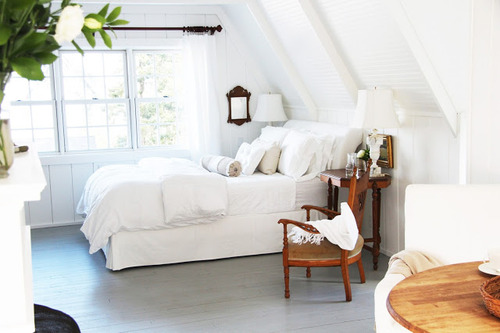
So, a friend and fellow designer John De Bastiani posted an image of this sweet little house on his Facebook page the other day and I immediately recognized the bunkroom picture from a shelter magazine… I have loved and coveted this room for a long time. And now, I glad to know who created this beautiful and respectful tiny house, Jessica Helgerson. 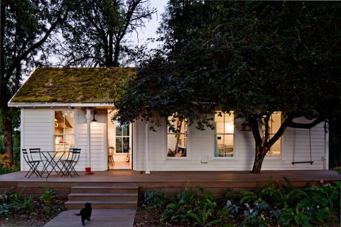
With more than 15 years of experience designing residential and commercial interiors Jessica creates interiors that are typically clean and uncluttered. Adept at many styles, she is happy to be guided by her clients’ individual needs and tastes as any good decorator is. Jessica likes to start by considering what the best design for the client might be while considering the best design for the building or space. Her goal is to ensure that the fundamental design and the materials are classic, long lasting, and appropriate to the building and its period. She likes to layer on fresh, contemporary elements—such as lighting, furniture, and art—that feel just right for the clients and for the moment. I’m a fan, and if I wasn’t a control freak.. I’d hire her to do my next house. Just look at this tiny house she designed!
 This little house is where Jessica and her family have been living for the last several years. It sits on a five-acre property on Sauvie Island, an agricultural island on the Columbia River 15 minutes north of Portland.
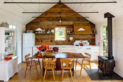
The house is an interesting experiment in reduction and reuse not only because it is only 540 square feet or because it was remodeled using nearly exclusively reclaimed materials, but because the building itself is now being recycled for the fourth time. It was first built in the early 1940s as part of Vanport Village; a quickly erected development built to house shipyard workers. When Vanport Village flooded in 1948 this particular little house was floated down the river to Sauvie Island, where it became the goose-check station. Years later it was remodeled to become a rental house.
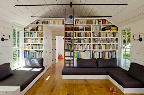
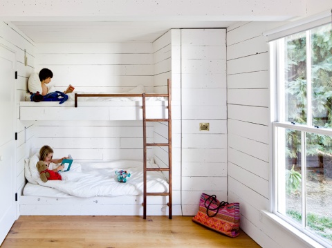
When Jessica and Yianni bought the property in late 2008, they decided to remodel it without adding to the existing footprint. Their first step was to redesign the interior for maximum space efficiency. A ‘great room’ houses the kitchen, dining room and living room with large, comfortable, built in sofas that double as twin beds for guests. Drawers under the sofas hold children’s toys and a wall of shelves houses books and more. The ceiling was opened up in the main space, but the bathroom and bedroom have lower ceilings to accommodate the parent’s sleeping loft above, accessible by a walnut ladder. The children’s room has two bunk beds as well as a full bed for guests. A pull-out closet makes maximum use of the narrow space near the bunk beds.
New high-efficiency windows come right down to the sofas and offer a fun way for kids and cats to enter and exit the house. The walls were insulated, then faced in reclaimed wood siding, most of which was found on site in one of the barns. The
new floors are local Oregon white oak, and the dining table was made from locally salvaged walnut. The range is a vintage Craigslist find, and the tub was a salvaged from a friend’s demolition site. A wood-burning stove easily and efficiently heats the small house.
As part of the remodel, the worn out roof was replaced with a green roof, planted with moss and ferns gathered along the Columbia River Gorge. The green roof offers insulation as well as a playful visual counterpoint to the traditional white cottage.
Despite its size, the house is welcoming and comfortable and nearly every weekend it is full of family and friends coming from Portland to enjoy a day in the countryside. In addition to living in a small footprint, Yianni and Jessica have been working towards food self-sufficiency. Their first year on the property they built a 1200-square-foot green house, planted vegetable gardens, rows of berries, and fruit trees. They are also raising chickens for meat and eggs, keeping bees, and making cheese from the milk of a neighbor’s goats and cows.

http://www.jhinteriordesign.com
*Much of this text was taken directly from Jessica’s website, with the intention of “getting it right” and sending the intended “message” out of respect for Jessica, her brand and her work.
I’m all about paying respect, honoring craft and celebrating others in my field. Please click on the web address above to see Jessica’s full website.
Joggers
October 28, 2014
 I didn’t create the trend but I’m certainly helping it gain momentum. The mens “jogger” is starting to show up everywhere (and by everywhere I mean every guy with style in NYC) and, I have joined the movement. I have 3 pair of mens pants with elastic at the ankles. Two are wool – one pair navy, one pair grey tweed and I also have a cotton pair… And I wear them in public. What’s the big deal you might be wondering, well two pair have elastic waists and one pair has a drawstring. To me those details belong on clothing only if worn at a gym, playing sports or on a sofa. But i pair them with chambray shirts, chunky sweaters and my favorite corduroy unlined sport coat and make sure my outfit looks “pulled-together”.
 This trend is not just for the guys… Girls are rocking pants and jumpsuits with cinched ankles and drawstring waists… SplendidLA in the SOHO area of NYC sells every type imaginable. If your going to make the leap, pair it with a tiny leather (or Vegan leather) jacket and ankle booties to be completely “on trend”.


SUMMER (house)
May 19, 2014

Believe it or not it’s finally time… Memorial Day is fast approaching and the season is beginning! Its time to paint the shutters, clean up the yard and air out the house. Roll up rugs if thats your thing. I’m thinking that the sand from the beach will be easier to get up with out the rugs in the way. Plus I love the look of the bare floors so I’m going naked (floors of course). I just finished painting the shutters Chrome Green (Ben Moore) the color is so old-timey/wasp/preppy… to be honest I might not have picked it, but it’s the color they have always been, so it suits me.
This tiny guest room recently got a fresh coat of paint. in fact it went from dark taupe walls and wall to wall carpeting to simply white (Ben Moore) everywhere. The walls are flat, trim satin and floors high gloss. I’m not going to lie, the carpet came up easy, and those wide board floors were there, so a simple rough sanding was all it took for the painter to get the finished look you see there. I tried to paint this room and the color was so dark, I gave up during the 3rd coat! Some things are better done a pro. The look certainly captures the spirit of an old beach house and looks chic mixed with the “unintentional” look of family cast-offs, “temporary” furniture that never got replaced and nautical kitsch collected for generations sprinkled in.
 There are still gallons and gallons of paint left to go, but this little house at the end of the road is quickly becoming a charming little beach house that is sure to see plenty of fun, laughter, relaxed days and maybe a few rowdy nights for years to come. The dogs certainly love running leash-free on the sand and going on walks (something they do do much of at home) so everybody gets a change of pace – not just me. Below are some inspirational images of rooms I like the look of… maybe some of these details will find their way into this little house.


the Hostess with the Mostess
May 12, 2014

I do ok in the kitchen. What I mean is I’m not a trained chef or baker but I get around a kitchen or recipe pretty well, provided I have the right tools and ingredients. For Mothers Day I wanted to do something fun and whimsical and wanted to avoid the lemon, berry,whipped creme trappings that are so prolific around this spring holiday, so I decided to make home-made Ding-Dongs. I followed a recipe from The Bean Town Baker and have to say they tasted even better than the real thing. The Bean Town Baker implies that there is a lot of work in these but that’s putting it mildly. I doubled the recipe, so it was double the work… trust me on this, that probably didn’t help. they are in her words a labor of love. Instead of posting the recipe (you can find that by clicking the link to the Beantown Baker page) I’m going to give you the inside scoop on this recipe.
So, First things first… if you are astute you’re probably scratching your head thinking “he said Ding Dong but the picture up top is a Hostess Cupcake, what gives?” well, here is the lowdown on that…


The ‘from scratch recipe for the cake used in the recipe suggests you use 9 or 10″ round pans. After baking mini-cakes are made with a cookie cutter, filled and glazed. There is a great deal of cake waste with this method, but you do get the iconic straight sided shape. Actually there is so much batter that the recipe suggests a bit of the batter be reserved and used for cup cakes – this way the round cakes don’t bake up too thick. (I was happy to imagine having extra cupcakes laying around the house, heck summer won’t be here til June 21st right?) Anyway, it wasn’t until I was well into my second batch that I realized the cupcakes would make perfect replicas of the famous Hostess cupcake, and the left over whipped filling and ganache were just enough to dress up a dozen or so of the “extra” cupcakes. I baked what I could in cupcake papers and the rest I just put in a well greased cupcake pan and both ways worked well. I liked not serving cupcakes with paper on them to my guests. And frankly, the cupcakes were easier, cuter.

And, I now have a Tupperware tub filled with chocolate cake bits – I’ll come up with something yummy to use them for – maybe mixed into malted ice-cream? or a trifle might be good… but I guess the moral of the story is, go for the cupcakes! They are easier to make, they don’t waste unused cake, they are easier to eat and they present better and more professional that their cousin the Ding-Dong and it’s all about presentation right? 
INSPIRATION II
February 7, 2014

Lots of things inspire me. Inspiration can come from anywhere, a stone wall, a piece of clothing, an old scrap of wood; and it can be applied in a textural, structural, spacial, or even in a literal way. What I find most inspirational is art and nature. The wharf image above is inspiring to me because not only do I dearly love the place, I love the image, and I love the colors. I love the warmth of the pattern on the sand, the strength of the pier silhouetted in black. And, because I have stayed many nights in those fishing shacks on that pier spending countless hours with some of my dearest friends, it means something to me. It doesn’t get more powerful than that. 
To execute design based on an inspirational object or image I think it best to identify a color palette first and foremost. This doesn’t have to be completely literal, you can take only the colors you find most pleasing; you can change the amount of each color within the palette to suit your taste or the space in question and obviously you can add to a palette.
I think the photo above with its rich browns, blacks and creamy warm walls captures the colors of the pier quite well. Overall the value of light colors and dark colors is pretty spot on. Not only the palette of the wharf is captured but a bit of the mood too. Strength, a bit of chaos, masculine, with a worn and weathered vibe glazed over the whole thing. This room is wharf like to me, I think it’s a good comparison.
 Here’s the same palette, stripped back to something much more sleek a more livable version of the messy working space above. This room gives a vintage undercurrent, it’s strong and masculine and has the boldness and the simplicity of the wharf image. it is the photograph refined down the essential oils of the colors, materials and strong masculine mood. Vintage, warm, woodsy, everything is just sharpened, clearer. To me the collection on the sideboard gives me a bit of the chaos of the wharf supports, the polished concrete is a great stand-in for the sand.
What inspires you? Have a favorite scarf? Use it. In love with the rolling hills of the Pennsylvania landscape in spring? Use it. Pick your colors based on what your comfortable with, go with your gut, but what you love. Oh, and don’t be afraid of not making a statement, sometimes a whisper is more of statement and more powerful.
A Dash of Brass
January 25, 2014
I thought I’d make my point by posting this the day after I suggested brass if you’re thinking about going grey…


The timelessness of a white kitchen is not lost on me, it’s something that will NEVER feels dated, or a relic of a time-capsule from days (or years ) gone by. Brass on the other hand has had its heyday and has been out of favor for some time.. but “it’s back”! The younger set who didn’t live through the last go around have discovered the warmth and beauty of brass and other warm finish metals are showing up everywhere. Show here with White and Grey, the brass is the perfect complement to the cool crisp aesthetic these kitchens possess. And, yeah… sure, brass could fall out of fashion again too, but remember it’s a lot easier and cheaper to change than countertops, cabinets and other major kitchen items.
 Fearful of taking the plunge but love the look? Add some accessories to your countertops or swap out a light fixture to update your kitchens look. Mixed metals is OK, trust me. Gone are the days of matching dining room sets, and matching metals… you just have to do it in a way that feels thought out, designed.


I’ll be honest it took me a while to get on this train. I have disliked brass for many, many years… but to be honest now that the market is so oversaturated with nickel, pewter, stainless and chrome a dash of brass really feels special.


